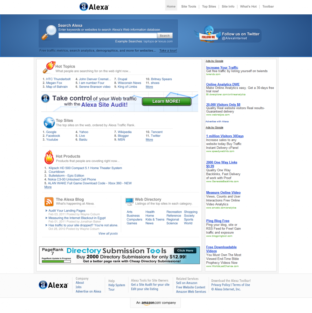
From time to time I will redesign popular websites writing all the changes I have done, why and how I did it. Today I redesigned Alexa.Com website because it looks kind of messy and without any framing of the tabs on the front page.
Don’t forget to comment and ask if you have any questions and also if you want to see any website redesigned write in the comments section and may be the following website redesigned!
Why do I redesign some popular websites? Well, for fun and because I love webdesign. I always recommend you to redesign some active websites because in this way you will get more experience, you will be criticized and you will find your “-” and “+” in your webdesigns so in this way you will learn new things and change some habits in your design. Critics are always welcomed because you will learn new things. You always have to be opened on critics, to think about them and learn from them.
Don’t forget to subscribe to stay updated to our design news! Also take a minute to share this post with others using Social Bookmarks.
Hope that nobody minds (especially Alexa.com right now) if I redesign their websites and explain the process. It’s just the look I see, more modern and eye-catching of the same content, nothing changed!
Let’s see the result (click on any image to make it bigger):
Homepage Overall

Header Design
The main fact of the redesign is to point out the search alexa because this is the most important thing you can do after entering Alexa.com. First thing you have to do is to check your website or any other website’s ranks because this is what Alexa does. You have to emphasize each site’s domain and what users are looking for visiting that website.
Here I used a nice palette of blue gradient, radial so the eye focuses on the search bar . The magnifying glass looks professional and has the same style as the gradient used and also with the website overall. The light brown color of the handle fits perfectly with the blue color.
Fonts: I like to write small, but not too small, just perfect so the eyes don’t get disturbed by the big fonts. The difference can be made by 1 px and can really change the look of your website overall. So the font sizes has to be the same and about 12/13/14 px (I used for “Search Alexa” title the font size about 16px and the other text about 13px). Behind the search I made a background that shows you from where the search begins and where it ends. It looks different if you frame each objects because this way they are not going to look like they are in the air.
In the right side I put the “Follow us on Twitter” box using the same style.
Hot topics tab
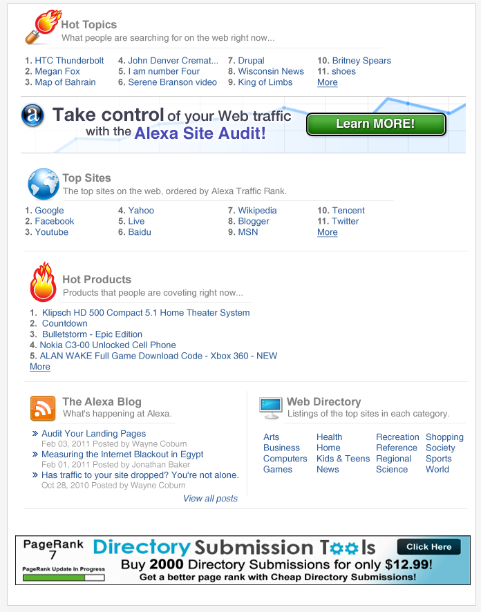
What I have done with the first tab was to integrate the details and the “Alexa site audit” advertise in the same background. The icon I used it’s the same idea as they had with the magnifying glass with a flame over it but made from more eye-catching icons.
The title it’s not too big with the description under it. Under the description I added a gray line to separate the links from the description because between them was a too big white space and the links wouldn’t have looked too nice.
Top Sites Tab
Here I used the same techniques as for the Hot Topics tab with the difference that I changed the icon to a shiny world icon, with a very nice blue gradient that looks professional. Did the same thing with the links.
Hot Products Tab
What I done here was to take the flame and put it on a horizontal way. Modified the links to show one column with long titles took from alexa.
Latest two tabs
Redesigning a website with a different style but using the same arrangement on page, the same tabs and text. That’s what I have done with Alexa.com. In the left side I put the Alexa Blog as it is on actual website adding two arrows before each title of the blog posts.

And finally… the footer!
What I changed here was to put the “An amazon company” to point out more the amazon logo. It also looks like a label of the entire website.
That’s what I have done redesigning Alexa.com Website! Hope you like the idea and don’t forget to comment and give me more websites to redesign if you are curious how are they going to look in a brand new style!


 5263
5263 2074
2074 1147
1147


Hey cool re-design. That’s such a great idea to practice your web design skills on popular sites. It is always easy to find faults or suggest changes, but it is another thing to actually change them and rework it yourself. Nice stuff.
Yes, it motivates you and also you will be able to compare them and improve your skills
Its difficult to find good blog on this particular topic. And you really looks you know what you are talking about. I have bookmarked your blog, will be coming back again. Just don’t let the quality of your site fell down.
Thank you Anette
As a Web Design Company India CYBERMOUNT is one of the fastest growing web site designing company spreading wings in USA UK and India. Expertise in Web Designing, Web Applications and Online Marketing.
Exceptionally informative many thanks, I do believe your current followers could quite possibly want a whole lot more blog posts similar to this continue the excellent effort.
Thank you for this kind comment. If more users are going to comment like this I certainly do more redesigns for popular websites.
I am lucky that I noticed this weblog , just the right info that I was searching for! .
Very soon this website will be famous among all blog viewers, due to it’s nice content