There are more types of logo designs: the ones with name + image and just with the name called typography logo designs. The difference is that the company it’s reflected only by the name without any image ( or logo ).
For example you can take the “My Ink Blog”. As you can see there is no other image than simply the typography designed so this blog can be recognized over the internet . You might also find these two type of logos merged in one piece (logo integrated in the text).
Typography logo designs should reflect the companies style, services and profile. Best example again can be “My Ink Blog” logo because as you can see Ink is designed like handwriting style but with the effect of a brush reflecting creativity, design.
So as you can see reflects that this blog it’s a design blog with unlimited creativity. Some companies use the both versions of logos. The “Nike” logo it’s the best example because sometimes on your shirt you will find simply wrote “Nike” and sometimes the text and logo above it. Both are very recognizable and either you see only the nike name or the logo you will know who’s logo it’s that.
Don’t forget to subscribe to stay updated to our design news! Also take a minute to share this post with others using Social Bookmarks.
You got my point about typography that should be really simple, recognizable and most important legible because the users eye should read instantly the name of the company or they will move the look somewhere else. Let’s take a look and discuss some of the following logo designs and also get inspired while we learn!
Typography Logo Designs
First I will show you some logo designs some of them being my favorite typography logos so far. It’s really hard to integrate the image into the name so it reflects perfectly the services that company have! Let’s take a look and learn from others.
Wrong / Right
This is one of my favorite logos on the web. It’s a briliant idea really well made and the font it’s great. Also the brush looks really nice and in some places you see white points which gives a great feeling of realistic brush
Bridges
This is really well done. It’s a turned up “B” looking like a bridge. Briliant idea but I think it could’ve been integrated better into the design. Maybe a more unique font, abstract looking bridge would’ve been better in my oppinion.
Camp
I discovered this logo not long time ago and I just loved it! The typography it’s perfect, fits with the tent style and also the tent looks really like he sould look: like a tent!
ZipHub

Great idea of the logo! Also the bold style point out the logo and the white space between “H” lines. If the font would’ve been regular the white space would’nt be obvious and the feeling of the design would’ve been lost. Perfect font choosing.
For Web

This logo may not be so legible , you may not understand what is written from the first blink of the eye but it will really attract your attention and will make you look at it until you read the name. The live and light colors look great and are not disturbing the eyes.
Advantage Tampa Bay Tennis
This is an example of a logo integrated in the text. The man with the rocket in his hand replace the “v” character and gives the logo a great feeling. Great logo.
ebywok
In this logo the characters were linked together. May not be too legible but looks really nice.
Logo Concept
This is a really awesome idea that makes this logo really eye-catching. The typography it’s simple. Even if it’s made of squares (or rombs) you will instantly read the “logo” word so it’s legible, creative and attract your attention. All the qualities that a typography logo should have.
EXiT

Lately this technique of drawing the “E” middle horizontal like into the “X” looking like an arrow it’s overused and lost it’s uniqueness. But this one has a great idea of completing the “X” of “T” and “i” lines. Looks really nice and “Tech”
safe
As simple as it looks as great it is! Same thing I said above about this technique too but you can say that the technique it’s perfect for this typewriting and for this logo. It fits perfect!
Zabransky

This is simple typography with not other elements or techniques to integrate characters. In this type of logos the font should look clear and very eye-catching. This is really elegant and gives you the feeling of professionalism.
Urjuan
Same thing with this one, good-looking, clear and legible typography!
903 Creative
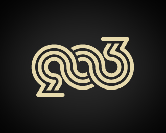
It’s sad sometimes that some ideas are getting more and more popular and overused. This is an example of the technique of integrating different characters with “o” .
No Boundaries

If you look the twice at this logo you will see that the border it’s resulted by continuing the “B” and “N” characters. Why do I say if you look twice? Because it’s so really well done that first thing you do is to read the name which it’s more than legible even if the characters are continued to the exterior.
Weather Works
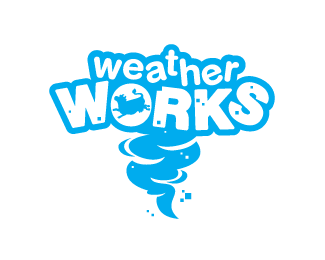
Most of the time big stroke text style reflects fun and I think this is a good example.
Logoshots
It’s a great idea what the designed made here but I also think that it’s a little bit too overwhelming and kind of disturbs my eyes. But this can be my oppinion!
Restyle
In this logo the background plays an important role. This will never look the same on a black background. I just love the font style and how it’s worked. Really well made.


 5263
5263 2074
2074 1147
1147


