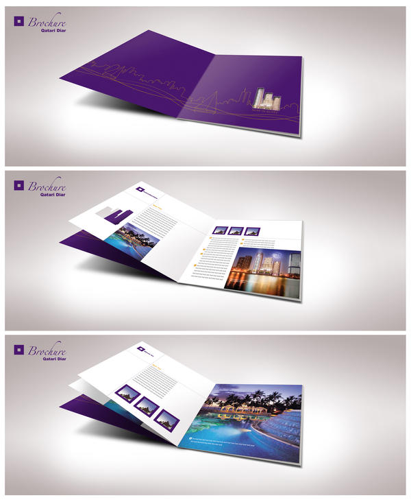
Printed marketing stationeries are one of the oldest and most extensively used marketing techniques. One of the most economical ways, this method of marketing has the deepest penetration into the intended market in terms of advertising.
Marketing stationeries are of various kinds like brochures, pamphlets, folded leaflets, business cards, posters, postcards, flyers and folders. A brochure can be have two or three folds and are called bi folder or tri folder brochures respectively. But the real question is when it is extensively used by everybody in the market, how does your brochure stand apart from the crowd?
1. Content:
Primarily one needs to decide as to what exactly the brochure should contain and what should it be able to convey to the potential customers. Decide on the aim of creating this brochure and the relevant content information thoroughly. While doing this, keep your reader in mind and include those appropriate details and information which a reader would be pleased or wanting to see.

2. Size:
Once this is ready, related entities like the stationery type, size, templates and themes can be zeroed in. Choose an appropriate size of the stationery and then proceed further. Using standard business dimensions is always safe and advisable. A 16.5 x 11.5 or 10.5 x 8.5 is a standard for brochures with fold. Other standard sizes are 11 x 14 is for a poster, 3.5 x 2 for a business card, 7 x 5 for a postcard and so on.

3. Template:
Based on the size and content which you have already decided, choose an appropriate template. A brochure template should be very flexible and should be able to accommodate various entities involved in the brochure design.
4. Brochure designing:
the sole purpose of a brochure design is to put relevant data in appropriate places, enhance the attraction, provide the data which is most useful to the customer, positioning of the whole content matter and try to drive the potential customers towards your business.
- Provide an appropriate and catchy punch line. Let it be short and yet powerful. Through out the brochure template let the texts be small, relevant and most informative to the reader.
- Use attractive and relevant images to supplement the text matter. Remember images can instill a sense of trust and security in the minds of customers.
- Use charts and graphs containing authentic and reliable data. It simply shows how your product is better than the others even without telling it!
- Placement and positioning of the content play a prominent role. Front face of the brochure should have attractive and interesting feature to encourage the reader to open it and go through the entire data. Do not stuff data anywhere.
- Use pleasant and attractive color scheme. Color can many a times give an image about the standards of a business. Fonts of the texts should no doubt be off the beat and legible but also should be professional and standard.
5. Innovate:
Use innovations to make the brochure interactive and interesting. Involve unusual but relevant shape; for example, an umbrella making company can have brochures in the shape of a ‘cloud’. You may include a couple of cartoon characters talking to each other; a way of displaying FAQs. Remember, creativity and innovation has no limits!

Finally proof read the whole brochure design template and check for typos in detail. You may also edit and trim the content to chop off unwanted elements from the design or text. Make sure you have the right resolution of the brochure template design; often the computer screen resolution is not sufficient for printing with sharpness and quality.
 Logolitic design blog
