It’s very important as a designer to know as much as possible because it’s in your advantage to take more money and have more clients that want different services. For example if you are a website designer it’s important to know logo designs as well and more important to code the websites you design.
Easy Custom Web Typography with Google Fonts API
The world of web typography is advancing with leaps and bounds. Already we have the options of SiFR, Cufon, Typekit, @font-face and now, Google has introduced their own custom font service under the Google Font API. Let’s take a look at what the Google Font API is and how you can use it in your own web designs.

CSS3 Minimalistic Navigation Menu
As you have probably heard by now, CSS3 animations are a powerful tool, which enables you to create animations which run without the need of applying additional scripting to the page. What is even better, in the next generation of browsers we will have even more powerful tools, including 3D transformations (already present in Safari).

CSS3 Glow Tabs
The other day I visited the jQuery Conference page, and immediately fell in love with the beautiful design and CSS3 technique applied to the tabbed navigation on that page. Visit the site in a Webkit-based browser (Chrome or Safari) or Opera 10.5, and you’ll see a nice “glowing” rollover effect along with a subtle inner shadow at the bottom of the inactive tabs.

How to Create a Fancy Image Gallery with CSS3
Even though CSS3 is still in the development stages, it is the new craze that many web developers are excited about. CSS3 is something that will take web development into newer and greater heights, while modernizing the web and allowing web designers and developers to make their creativity a reality.

How to make a CSS3 and JavaScript analog clock
This is a “How To” guiding the ones that are interesting in the creation of an analog clock, similar to the one on the left, with CSS3 and jQuery. First of all, I would like to say that this is in no way a useful method of placing an analog clock on your website. It’s only meant as an experiment with CSS3. If you do want an analog clock, you could probably use Flash or an image based JavaScript clock.
Letterpress Text Effect Using Photoshop and CSS
Letterpress effect looks good in modern websites, letterpress effect can be gain using Photoshop and also using text-shadow property of CSS. So here today we will learn how to achieve Letterpress effect with photoshop and also with Css and in the end of this tutorials we have also collected some tutorials on Letterpress around design community.

Creating an Animated CSS3 Horizontal Menu
Inspired by CSS Sprites2 – It’s JavaScript Time from A List Apart and Using jQuery for Background Image Animations written over a year ago, I decided to create a short tutorial about a animated menu just using CSS3. In fact, I am using the same principle of moving the background image from one position to another, in this case from left to right, the only difference is that I am using the CSS3 property transition to create the animations. This shows us how powerful CSS3 can be and how we can save some JavaScript code to achieve the same result. As you know, right know the transition property is only supported by Safari and Chrome.

CSS Fundamentals: CSS 3 Transitions
As CSS3 rolls out around the web, it is bringing some interesting new presentational techniques along with it. Today, we’ll review the basics of using CSS3 transitions and animations to add an extra layer of polish.
Awesome CSS+JS form styling
I was working on our new open source project that i think you will like and I was working on the registration page. This is what I got in the end and i will walk you trough the process with me. This new tutorial is about styling the forms of your website, I find it very good looking and very simple to implement. We will use simple CSS and some JavaScript.
How To Make a Drop Shadow Changer With jQuery and CSS3
Today we have a very cool and step-by-step tutorial on how to make a CSS3 drop shadow changer using Ajax and little bit of PHP/MySQL. You may ask yourself why I’m using PHP/MySQL in a CSS3 tutorial? and the answer is simple, to save the settings and fetch again.

Styling a Simple Form using CSS3
Recently, I had a simple project of designing and developing a newsletter subscription form that was only going to be viewed on and iPhone or iPod Touch device. The form, and all of the inputs, would have nice rounded corners (which I am an admitted sucker for) and subtle gradients.
![]()
How to Create a Cool Anaglyphic Text Effect with CSS
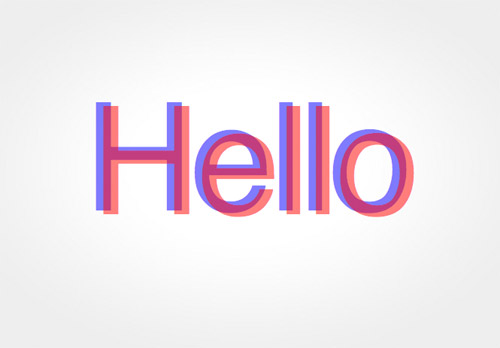
Anaglyphs are those amazing 3D images that are created by offsetting two of the red, green and blue channels, and are viewed with those nerdy looking 3D glasses with different coloured lenses. I don’t know if this effect works for real, as I’ve unfortunately misplaced my 3D specs, but it’s a pretty cool text effect nevertheless! Let’s take a look at how a similar style can be created for sprucing up your web designs, while taking into consideration semantics and avoiding the repetition of any markup.

How To Create Depth And Nice 3D Ribbons Only Using CSS3
In this last period on PV.M Garage we have described many trends of the modern Web Designand many techniques for creating stunning and impressive web sites.
In one of our tutorials we learned how to realize a nice 3D ribbon and how to play with the drop shadow in Photoshop to simulate depth in a web design layout. This is a widespread trends in recent web design: creating a 3D perception in a website and simulating a “world” in three dimensions are two great ways for the designers to play with their skills.

How To Create Simple, Stylish and Swappable Image Captions
While they say a picture is worth a thousand words, not every image is self-explanatory. Sometimes a few words of description or context can make the difference between a confusing image and a clarifying one. That’s why image captions are often a good idea.

Using Text Shadow in HTML/CSS
In this post, I will discuss the topic of using text shadow in HTML/CSS. Text shadow is a property from CSS2, and what it does is simply apply shadow to the text. Moreover, text shadow allows you to create a somewhat moved or blurred copy of a piece of text, to do positioned or color shadows, to create the appearance of 3D effects, to create more than one shadow (which gives an interesting effect all its own), and to make many other interesting effects.

A Beautiful Apple-style Slideshow Gallery With CSS & jQuery
When speaking about design, there is one company that is impossible to go without. Apple values design – being a new product, a fancy catalog or their website – there is always something to admire.

Using Rounded Corners with CSS3
A few years back, rounded corners became one of the signature design elements of the Web 2.0 trend. Even though they started as a fad, rounded corners are more than simple eye candy. They also have a role inseparating or grouping the sections of a page.

Make Web Site Elements Partially Transparent
If you’ve worked with Photoshop, you’ve probably adjusted a document’s layers opacity to create transparency effects that blend layers together. And if you’ve placed text over a photo in InDesign or QuarkXPress, you’ve probably added a transparent screen behind the text to dull the photo’s contrast and make the text legible.

CSS Polaroid Picture Tutorial
Polaroid pictures (or fake ones anyway) can be created using Photoshop or a similar graphics package but I aim to create the same kind of look by using CSS. I think it should be simple enough but we will find out shortly. Basically I want to create something like this:

CSS And You: Building From Imagination
In the early days of HTML, site design was limited by what could be achieved with simple tables and frames. With the birth of primitive CSS in 1993, was the ability to build more unique sites. Though CSS1 was fairly counter intuitive, the following version CSS2, was much easier to use and was built with HTML tag coding in mind.
Create a Letterpress Effect with CSS Text-Shadow
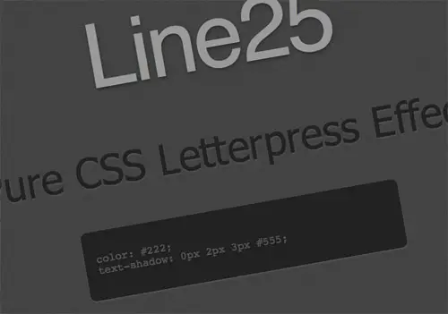
The letterpress effect is becoming hugely popular in web design, and with a couple of modern browsers now showing support for the text-shadow CSS3 property it’s now simple and easy to create the effect with pure CSS. No Photoshop trickery here!

The Shadow Effect In CSS3
Shadow in website design is something that can be achieved by using CSS and images, to achieve shadow in CSS2 you would use images and positioning, it can be achieved but it usually means that you have to create multiple divs. See my tutorial of creating shadow in CSS2 but one of the exciting new attributes in CSS3 is box-shadow which allows someone to get a nice shadow effect with just using one attribute applied to a div.

Better typography with CSS
IT’S A COMMON frustration for print designers moving to designing for the web that the typographic controls appear so limited. There’s a tiny selection of web-safe fonts – until recently, no font smoothing or anti-aliasing – and you can forget about manual kerning. Many designers resign themselves to using Arial, or Helvetica if they’re lucky, and setting the leading (the line height) and leave it at that.

Facebook picture tagging system
Facebook might look minimalistic on the outside but it’s a beast from the inside. I don’t know how they did their “cross over a person to see his name” tagging system but i’m going to show you how to fake it. Who knows, maybe they use the same technique (yeah right).
Rounded Corners In CSS3
Before you read on you must be aware that support for CSS3 in browsers is scattered all over the place, to be specific only Mozilla and Safari browser users will be able to view the rounded corners effect correctly, because Mozilla is using it’s own method of border-radius and Safari is using the Web-Kit, which has various CSS3 elements bundled in. Im unsure if any other browsers have the border-radius element or any of the web-kits built in, so if you can’t see the rounded effect the reason for it is your browser doesn’t support it! However if you do find browsers other than Mozilla or Safari supporting the border-radius element, message me.

Adding Shadow To Your Divs In CSS2
Although the W3 (World Wide Web Consortium) have sent out CSS3 (New version of the CSS language) to various browser company’s such as Mozilla and Safari. Support for it is not high enough, so some of the great attributes that CSS3 will be bringing in such as box-shadow which allows you to add shadow (that we will be creating in this tutorial) with one attribute. So we’re going to have stick to CSS2! Creating shadow in CSS2 is a question that’s pretty popular amongst the web-dev community as there’s no straight attribute to create it, instead to create it one method you can use is a transparent .png image along with one special div defined before any other content/divs on your webpage.

Pure CSS Light Box
A light box is web slang for a way to divide and present such things to your viewers as pictures in a gallery or special site notices. Today I wanted to quickly show you how to create a pure CSS light box. Lets start with our light box structure.
Pure CSS Hide and Display Content
jQuery & CSS Example – Dropdown Menu
Dropdown menus and menu bars have been heavily used since the early days of graphical user interfaces. Their use has become ubiquitous, and even expected, in desktop applications, and the web has quickly followed suit. This article is intended to describe an extremely basic, yet extremely powerful, technique for adding dropdown menus in your application user interface or website design.
Bulletproof Transparency Box
Improving Form Usability with CSS
Here is a really simple technique that will help Firefox (along with its spinoffs, flock…), Safari and Opera users better enjoy online forms. I am sure most of you have used safari at least once. When using it you would have noticed that anytime you go to input information into a form field the field displays a light blue glow around the field. This greatly helps a user find which field is selected as well as it is just overall more visually pleasing.

Images Within Form Fields
Adding Background images to your form fields can be easily accomplished with CSS and can add wonders to the look of your forms as well as improve the usability for the user.

Horizontal Menus That Grow on You
In this quick tutorial, I’m going to discuss how to create a neat little menu effect. I’m dubbing it the liDock, because elements in the menu resize as the mouse moves over them, similar to the dock on OS-X, and because it’s a list menu.
Pure CSS PopUp Thumbnails
Here’s a neat effect that will allow you to display a thumbnail image for a link on hover (similar to the technique used at www.digitalart.org – except ours will be pure CSS).
Fluid CSS Speech Bubbles
Speech bubbles are a common sight in comic books, video games and web pages. People have been using them for many years, so it?s only natural that they would crawl their way onto the web. Unfortunately, creating speech bubbles which expand according to its content has been something which was normally achieved using tables. However, creating the neat little bubbles is a simple enough task with the use of CSS by using a series of nested divs. In this tutorial, I?ll describe one manner of creating the speech bubbles with CSS and a few images.

Totally awesome hoop earrings available at LusterForever jewelers stores
Get mcts demos for 70-442 and 70-169 with 100% success guaranteed.Our high quality 70-448 prepares you well before appearing in the final exams of 70-621.


 5263
5263 2074
2074 1147
1147


Great share! These things look good. Gonna try them when I have the time. Thanks! Gonna bookmark this one.
Thank you @Bryan
really helping css techniques you sharing. thanks
you are welcome!
superb set of tuts, thanks very much
you’re css teachiniques are great.
Thanks for sharing it with us and this will be a big help for all people reading this.
Thanks!
These things look good. Gonna try them when I have the time. Thanks!
Excellent collection of tutorials, thanks!
really nice tutorials thanks for sharing..
Great collection thanks – especially the form ones which will come in really useful. Thanks
Again thanks. and also thanks Google to provide another useful service that will save me time. I often need to create nice heading for web pages. now i can do that without having to use photoshop
Excellent tutorials, I have sent this link to my designers as they can make use of it.. Thanks for sharing this with us.
This is a great collection of tutorials. ! I can’t wait to start.
Ah, no. Not more rounded corners and drop shadows!
Great to see some other quirky ideas in there as well.
i got some idea related css2 and 3 , i think here after my designing thoughts have been change , for that thanks for above nice collection………………….