If you were looking for layouts tutorials in photoshop here you have some options to choose from. I compiled 25 layouts tutorials in adobe photoshop for creative designers that want to improve there skills or simply wants to try something else to design like layouts. I selected from very easy basic tutorials to more hardly ones.
Create a clean hosting layout
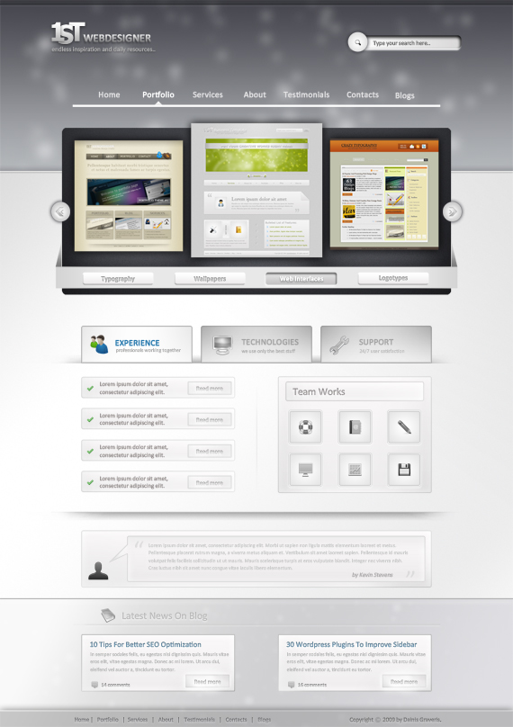
In this tutorial I will show you how to create a simple and nice looking hosting layout in a few steps. You can create this layout in almost one hour. It is very easy and the end result is quite good. You don’t have to be a professional designer to achieve a nice result.
Web Design Layout

Good evening everyone, today il be showing you how to make a colorful web design company layout. The website features multiple enlightening colors and a simplistic navigation with a 3D hover.
Create a nature inspired layout in photoshop
In this tutorial I will show you how to create an unusual website layout inspired by nature. If you have the right photos you will need less than 30 minutes to complete this layout. This type of tutorial was requested by Grafpedia Members.
Create an Apple inpired website layout in Photoshop
In this tutorial I will show you how to create an apple inspired website, very clean, and very attractive in the same time. This layout can be used very easy to showcase your portfolio, or your art work.
Photoshop Web Design Professional Layout Tutorial

since it’s the first professional web design Photoshop tutorial over here, I really want to hear your thoughts – where should I focus on and do you enjoy and want to see such tutorials more in future! Tutorial is also for advanced users, but I really tried to explain really detailed those hard points.
WordPress Layout #6

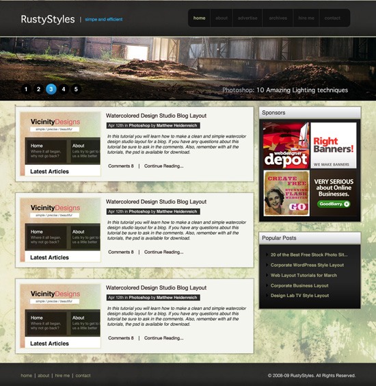
Welcome to tutorial 230, in this tutorial il be showing you how to create a sleek, clean and spacious wordpress blog.
How to design a simple and sleek web Portfolio
In this guest tutorial Narendra Keshkar will show you how to create a very beautiful portfolio layout. This is our first Guest tutorial. If you want to write a tutorial for Grafpedia please read
Create a photorealistic web layout
In this tutorial I will show you how to create a simple photo realistic website in just a few steps.
I know it is hard to believe that a website like this can be converted into a real website.
Create a wordpress interface in Photoshop
Hello and welcome to another tutorial on Grafpedia. In this tutorial you will learn how to create a unique WordPress theme to showcase your portfolio. This layout can be used as well for a business website.
Design an amazing 3d hosting layout
If you want to create a web page for representing web hosting company of any kind you have to follow this tutorial step by step. You will be able to build a professionally looking and competitive online presence which will be highly evaluated by your customers.
Create a Clean and Effective Product Layout
In today’s tutorial we’re going to show you how to create a clean and effective product layout in Photoshop. This layout can also be easily converted into a portfolio layout.
How to Create a “Worn Paper” Web Layout Using Photoshop

In this tutorial, you’ll learn how to create a textured “worn paper” web design theme using some basic Photoshop techniques. The design incorporates some free stock images to let you create a beautiful layout in a jiffy.
How to Create a Sleek and Textured Web Layout in Photoshop

In this Photoshop web design tutorial, you’ll learn how to create a full web page layout that combines the sleek and textured look-and-feel using a combination of beginning to intermediate Adobe Photoshop techniques.
Create A Stylish Portfolio Layout
In this tutorial we’ll show you how to painlessly create a stylish portfolio layout in Photoshop. We’ve even gone a step further and added jQuery functionality to allow your potential clients to easily navigate through your latest work without leaving the page. This tutorial is targeted toward intermediate Photoshop users. You should have a basic understanding of all of Photoshop’s Tools, as well as the ability to create new layers when needed and how to navigate through Layer Styles.
Dark Layout #2

Welcome to tutorial 209, in this tutorial we’ll be creating a dark layout with some nice unique styling. We’ll also be making our very own custom patterns to go with the layout.
Creating a tech blog layout in Adobe Photoshop
In this tutorial, you’ll learn how to design a “Premium” blog layout in Adobe Photoshop, from A to Z. If you have any questions about this tutorial don’t hesitate to ask in the comments.
How to Make a Creative Blog Layout
Create a Promotional iPhone App Site in Photoshop
In this tutorial, we’ll be continuing this series on creating an iPhone app promotional site by taking our previous Fireworks constructed wireframe and adding color, texture, images, and effects to polish off this design in Photoshop. We’ll use some interesting elements, like iPhone imagery and a stylish aurora vector background illustration. We’ll finish up with a professional site design ready to get coded! Let’s get to it!
How to Create a Unique Colorful Site Layout
How to Elevate Your Website Design Process and
Results
This tutorial will guide you through the process and ideas behind the designing a professional website with a funky flair in Photoshop. The tutorial will read much like a “choose your own adventure” novel in the hopes it will encourage creativity and uniqueness in your design with a little advice and instruction along the way. Adventure time!
Create a Magic Night Themed Web Design from
Scratch in Photoshop
Five Looks, One Layout: How to Develop a Library of
Web Design Styles at Your Fingertips
How a Simple Layout Can Be Mixed ‘n’ Matched with
Patterns, Photos and Backgrounds
Create a Dark Themed Web Design from Scratch
Create a Sleek, High-End Web Design from Scratch

WordPress Layout #6
Welcome to tutorial 230, in this tutorial il be showing you how to create a sleek, clean and spacious wordpress blog.
![]()
Setting Up The Canvas And Guides
Create a new document 1200 x 1520, fill your background layer with the color #e6e6e6.

The layout were making is going to be 900px wide, so were going to need to setup some guides. Go to “view > new guide” from the menu at the top, in the box that pops up enter the following settings.

Do the same again only this time enter these settings.

Creating The Header
Select the rectangular marquee tool, then create a rectangle the width of the canvas and about 80 pixels in height. Fill the rectangle with any color then add these layer styles.


You should have something like this.

On the left side add your wordpress website title and slogan, fill the text using the color #979797. Once you’ve added your title and slogan add a drop shadow using the settings below.

You should have something like this.

Creating The Navigation
Using the text tool add some dummy links to the right side of the header.

Using the rounded rectangle tool make a selection around each navigation link.

Fill the rectangles in any color then add these layer styles.


You should have something like this.

Creating The Welcome Area
Using the rectangular marquee tool make a selection underneath the header, make sure the selection is on a new layer underneath the header.

Fill the selection with any color then add these layer styles.


You should have something like this.

Were now going to add a character from wefunction, click here (http://wefunction.com/2008/11/free-character-pack/) and download the character pack. Once you’ve downloaded it, extract it too your hard drive then open up “002__002.eps” in photoshop. Drag the character over onto your canvas and position it like the image below.

Chop the characters legs off just below the stroke on the welcome area.

Finally add a drop shadow using the settings below.

On the right side of the character add a simple sentance about your blog.

Creating The Content Area
Select the rectangular marquee tool and make a selection on the right side of the canvas against the right guide. the rectangle should be about 600 pixels in width and as long as you see fit, you can always resize the rectangle later to fit the content.

Fill the selection with any color then add these layer styles.


Create a new layer underneath the content rectangle, then select the polygonal lasso tool. On the corner of the content rectangle create a triangular shape like the image below.

Make sure the selection doesn’t go below the welcome area’s stroke. Once you’ve created the selection fill it with the color #a9a9a9. You should have something like this.

Mocking Up The WordPress Posts
Inside our content area, lets begin to mock up our dummy posts. Select the type tool and add an example posts title using the color #666666 and font size 24pt. Underneath the post title add some meta data (E.G post time, post date, author and category).

Underneath the post meta data add a 1 pixel line using a light grayish color. Now head over to woothemes and download this icon pack (http://www.woothemes.com/2009/09/woofunction-178-amazing-web-design-icons/). On the right side of the post title add the speech bubble icon with some text saying comment here.

Finish off the post with a dummy image and some dummy text. After you’ve added the dummy text add a read more button using the buttons from the navigation. Ive also thrown in some social buttons for good measure.

Creating The Sidebar
The sidebar will be located on the left side, opposed to many blogs which display it on the right. In the sidebar im going to add a flickr gallery first, create a heading using a font size of 18pt, use the color #666666 for the heading color.

Underneath the flickr gallery title add some small thumbnail like images to act as our dummy flickr gallery. Before we continue adding our sidebar elements let seperate each part using a simple separator. Select the rectangular marquee tool, then create two 1 pixel lines on top of each other. Fill the lines in two different colors, the line thats on the bottom fill with white and the line that sits on top fill in a grayish color darker than the sidebar background. Finally drag the separator lines layer underneath the content box layer so they disapear nicely behind the content box.

Continue to bloat out your sidebar with the elements you’d want in the sidebar, ive added a simple recent comments list and some website sponsors.


Creating The Footer
Duplicate your welcome area background then drag it down to the bottom of the canvas. Open up the layer styles window then switch the colors between the stroke and the inner shadow. You need the make sure the white line is underneath the dark gray line else you wont get the indented effect.

On the left side of the footer add a nice twitter icon with speech bubble next to it. The speech bubble was from the custom shapes libary from within photoshop.

Add a dummy twitter post inside the speech bubble then stick a header over the top. On the right side of the footer add your copyright information and maybe another little character image from wefunction.

Creating The Pagination
Select the rectangular marquee tool or the rectangle tool and create a couple of square boxes just over the footer stroke. Using the same method as we did for our content box , add the little triangular grey shapes to make them look as if they are wrapping around the footers stroke.

On the right side of the footer add 1 single square with a little arrow inside it, again use the same method as above to get the 3D effect.

Well Done… Finished
Thats it all done, heres the finished layout.

 Logolitic design blog


Pretty cool examples here… didnt dig into the external URL´s but i´ll save this i might use in future keep it up!
thank you designi1
This is a great collection of tutorials. Thanks for sharing.