Redesigning a logo is certainly much more difficult than creating a new one mainly because of the fact that the designers have to deal with dual challenge in such situations. Firstly, they have to create something which is more appealing than the older one and secondly, they also have to deal with the longstanding reputation of the previous brand identity. However, the revamped logo versions discussed above have certainly been able to cross both the hurdles and that is why they have been able to grab a spot on this list. Finally, these are really some great logo redesigned.
1. Windows 8 logo

It has been a longstanding trend of Microsoft to introduce a new logo with the release of every new version of its Windows operating system. The famous multi-color logo design of Microsoft has been revamped completely. The anticipated release of Windows 8 coupled with an unusual logo design has certainly created waves in the entire industry. Pentagram partner Paula Scher has designed the new identity for Microsoft Windows. The most unusual thing about this logo is its simplicity; the entire logo is of the same color using the same International Typographic Style.
2. JCPenny logo

JCPennny was established in 1902 and is one of the most renowned departmental stores in US. Over the recent years, its logo design has been modified quite a few times. The last revamp of the logo took place last year in 2011 and now it has been again modified in January 2012. The last revamp done in the year 2011 was not able to create much hype; however, this time JCPenny has tried something out of the league. By adding blue color in its design, JCPenny has attempted to infuse more patriotic spirit into its corporate identity.
3. American Red Cross logo

Red Cross is one of the most renowned symbols to be seen during disaster situations or at emergency. Several organizations have adopted a literal logo for their corporate identity, and Red Cross is one of them and perhaps the one which is respected and trusted all around the world. Formally known as American Red Cross, this organization has revamped its logo in 2012 to a more active and dynamic icon. After using the ‘first-aid style’ symbol for decades, they have finally switched to something new. Now the Red Cross symbol is encircled in a white badge style circle.
4. Jaguar logo

Another popular example of literal logo design is the logo used by Jaguar, which is one of leading car manufacturing company of England. The old logo consisted of only a silhouette of the animal which depicted a Jaguar leaping over the typeface. However, the new design has given a metallic touch to the Jaguar, thus giving a new life into the identity of the logo. Creative agency Spark44 introduced this new logo in one of its marketing campaign. The new logo signifies a growler and leaper Jaguar.
5. Dulux logo

Dulux is certainly the world’s most recognized Paint Company. However, you’ll be surprised to know that the most popular paint company used to have a logo with no colors. Yes, we are talking about the former British paint brand Dulux. Earlier, it used to have a very simple logo in dark blue shades and Italic fonts. The new design ensures that the logo appears much closer to the true nature of the company. Now, the logo holds a tagline “Let’s color” along with a colorful wave.
6. Jack In The Box logo
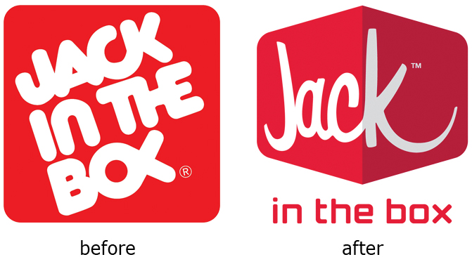
Just like their mascot (Jack), the new logo for Jack In The Box is also modern, quirky and fun. Not only that the new logo is exciting, but also the brand extensions offered by them for different types of sandwiches are fun. Duffy & Partners have designed this new logo. However, the “in the box” text in the logo which is now placed under the image doesn’t appear to be a part of the logo, in fact, it seems like more as an afterthought.
7. KFC logo
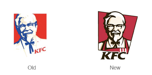
KFC has introduced a new version of their logo. The colonel in the logo now wears an apron in place of his suit coat. It seems like that the colonel is ready to serve you and is much more inviting and friendlier. The new design adds a nice dynamic feel to the logo by introducing a new angled backdrop.
8. Pyramid Beer logo
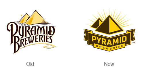
The new logo of the Pyramid Breweries places more emphasis on the geometric pyramid symbol. The redesign of the logo is distinctive and simple which also makes it much easier to read. The new logo basically concentrates on communicating distinctiveness and boldness. Several new and bold label designs also accompany the new logo.
9. Sprint

Sprint had undergone a massive re-branding campaign when Sprint merged with Nextel a few years back. The Sprint name is now merged with Nextel’s appealing black and yellow color scheme. The Sprint signature ‘pin drop’ is the theme for the new symbol. The sans serif typeface has provided a new modern look to the logo. The logo produces a bright shine when the symbol is set in motion.
10. Chicago Olympic Bid
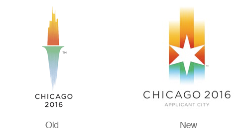
The new version of the Chicago torch logo will certainly not disappoint the admirers of the older one, because it is just as brilliant as its predecessor. The new logo features cool gradients which represent Lake Michigan, whereas the warm gradients depicted in the logo represent the sunset.
11. Detroit lions logo
Although the Detroit Lions logo was one of the most anticipated logo revamp of the year 2102, but unfortunately, it was not able to impress everyone. However, several experts and critics are of the opinion that it is a step in the right direction. There are no drastic changes in the newer version, but it has more definition and defines the legs, arms, face and mane.
12. Delta Airlines logo

This new Delta Airlines logo is certainly sharp and it is more of a realign than a redesign. The new logo provides modern feel because of the all caps sans serif typeface, also the colors are more subdued. The designers have made sure that the logo doesn’t gets into cheesy 3d effects, but still they have been able to provide a nice dimensional aspect to the new version.
13. Cisco Systems logo
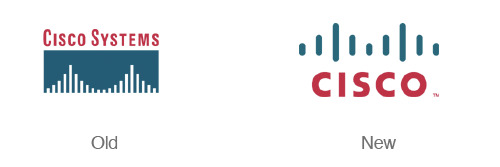
The revamped version of the Cisco Systems has gained a lot of attention lately. The logo now consists of new simplified ‘bridge’ which makes it much more bold and memorable. However, the most noticeable change in the logo was the decision of dropping ‘systems’ from the logo. Earlier, the logo used to say “Cisco Systems”, but now, it only consists of the word ‘Cisco’.
14. Best Buy logo

The Best Buy logo now concentrates on achieving a more modern look by switching from the ultra bold typeface and chunky yellow price tag to a more subtle logo design. The signature yellow price tag of the previous logo is still present in the newer version, but in much more delicate way.
15. Swisscom logo

The best thing about the revamped version of the swisscom logo is that it is simple and dynamic at the same time. This logo designed by Moving Brands produces a bright shine when it is set in motion. It uses the sans serif typeface with curves on the ‘I’ and ‘M’ for reflecting the curvature in the mark.


 5263
5263 2074
2074 1147
1147


Its very nice to have this new and old design of this product. You did a great job to improved the logo’s.
I like the new logo of jaguar.. It is much attractive compare to the previous one. Thanks for sharing these logos. You made me think to make my own design.
All new logos are really cool and fantastic.
Most of them are an improvement to my taste. One i liked better before (because it was so simple) was the one from the American Red Cross. Less is more.